
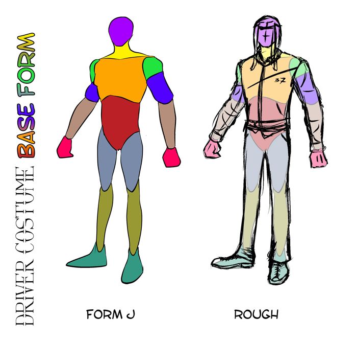
Sorry for the delay on updates, still been fighting off the food poisoning been having a few on off days but I think I'm finally there now. I was meant to post this up earlier not long after the portraits final for Driver but I guess at least its here now. Anyway this post is fundamentally about the Driver's costume and any resulting development from the basic forms I had explored in previous posts.; I have done a number of costume tests ultimately combining elements from each of the test samples. I wrap it up with a bit of a lighting colour test which didn't work out brilliantly but its a start...
From here I also start the car development from today onwards, this will hopefully be more simple because I was instructed not to derive too far beyond the cars realistic dimensions. This should mean any alterations I make to their base form will be slight. Alan advised me just to make the tires a little bigger or the lights a little more flared etc. The real challenge will come from making them look old and specifically from the day car (it being smashed up). I also have a few poses to knock up just to finalize Driver in his costume fully complete and obviously expression sheets. Then I have his final pose which I will go into detail much like his final portrait.
Anyway lets get onto this post, we will have to see how this goes...
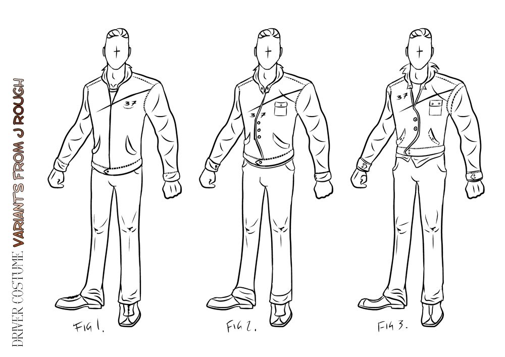
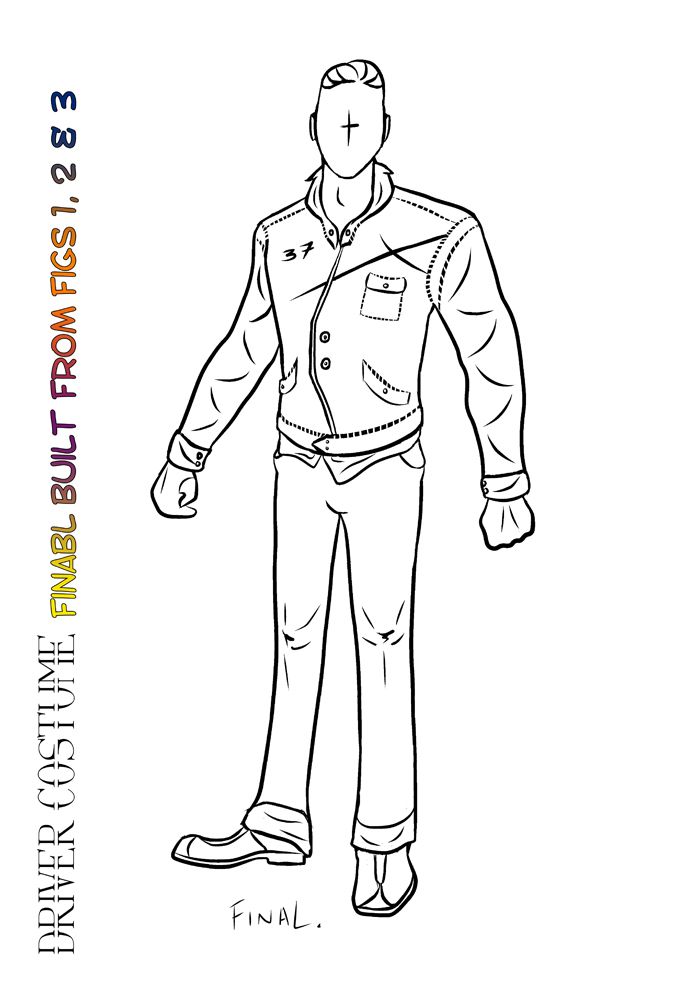
The 3 form variants from rough (shown above) were created from the original rough form at the top of this post. Fig 1 was a basic jacket but I felt this looked more like a fleese (something I wear every day) so I was worried that was rubbing off on the final design of the jacket. Fig 2 was more jacket like and I loved the idea of a cut across the jacket. I also removed the laces from Fig 2 just to see how it would look. Fig 3 I shortened the jacket more and dragged some unkempt shirt tapers from under it. This made the costume feel a little more dynamic then it was so I liked this.
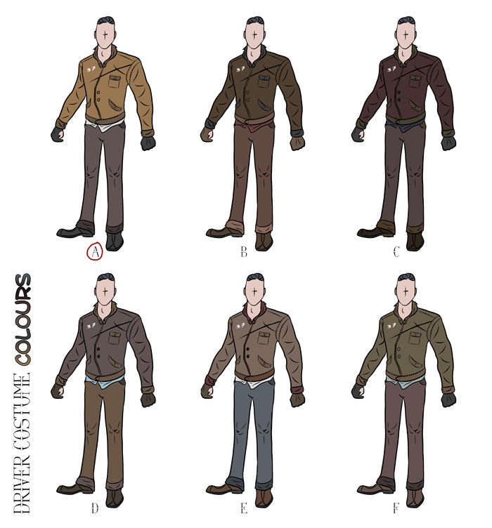
Next I decided to do a few colour variants but I couldn't fall much further then A it even worked with the rough original I drew of the jacket. Then I still was a little worried that A was again more modern, the white shirt felt right. If I was to say another it would probably be E or F. I really thought they kept the feel very drab still the scheme felt right to the time period. The one constant throughout all of these was to keep the number "37" in white on his jacket which is mainly because its written in amateur paint. This was mainly to keep it in toe with the jackets reverse side.
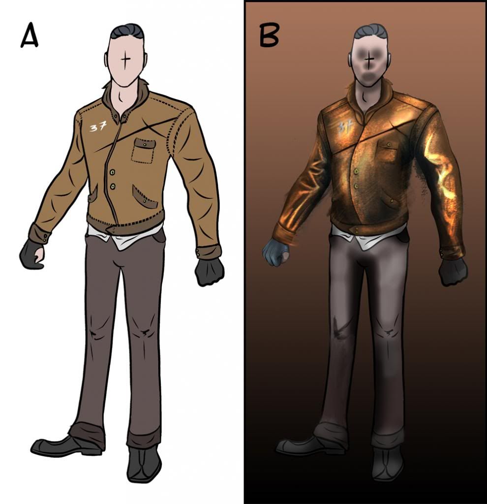
The image above shows the final choice made with some slight lighting test being utilized (B) this is what I mean to talk to Alan about this week. One of my biggest weaknesses is getting the lighting right when I actually start to get into an image. Often it feels as though I am making the light way too dense for the image as opposed to other artists who use a much more subtle palette. I even had this issue on the Drivers portrait but because the face is localized I found it easier to establish the light source. In this case everything feels a bit too lit...
I will raise my concerns with Alan today and hopefully get to final poses for this guy and begin getting into car mode. I know I have been saying that for a while now but today really is the day I have the cars printing as I speak. The real challenge here will be drawing something which is not organic. I'm usually terrified when I have to start working on anything that doesn't involve flesh probably the same reason that the lighting on clothes is an annoyance to me. Anyway hopefully by the end of this weekend I should have more things underway.
Take it easy people!
xXStItChXx
No comments:
Post a Comment