
Monday 25 February 2013
Unit 9: Adaptation - Time Management (Part 2)
Hello Everyone,
Its that time management time again with some minor banter about how my project is going thus far, creative partners do not worry I will fly over your blogs today. I have just been trying to catch up on a few other things so apologies for the delay there. I have established this far that I have to get into my character mode a little more which I will be doing from tomorrow onwards. I will then be getting into my cars a little just to get some sketches together for the magical green light moment on Friday. I aim to be modelling by the end of the next week or so which will give me enough time to get my 3 characters fleshed out (Driver, Day Car, Night Car).
I have turnarounds to make after getting into a little more of the concept phase which is why the modelling process has not happened sooner. Once I have them built there is the basic UV mapping and poly-painting. I will be posing the driver with his cars for a group shot and then also have the individual models ready to use in a games engine. I have triangulation to explore with and hopefully in the next batch of Maya videos, these will help me later on when I get onto my games meshes so I really will be getting into that soon, defiantly before I model my own games characters.
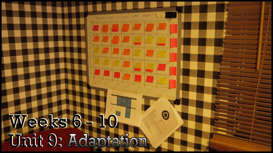
The terrifying task board, for Unit 9 Part 2 is shown above this unit will consist of 3 - 5 week periods so you may have to ignore what I typed on the first time management post. I have only experimented with some stage 1 concept not been into the cars yet but that will be happening before Friday so I have something to post for the green light on Friday. Everything here is much more spaced out which is how it is best achieved, when you start getting more things in one day you find yourself snowballing the tasks down days and no one wants to be there trust me lol.
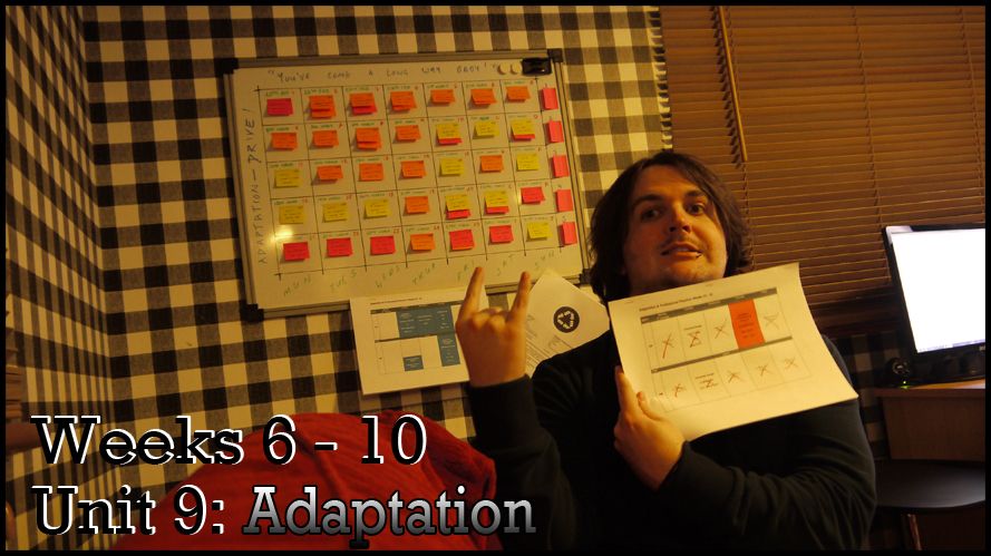
This is me holding the previous section of time management (part 1) which is our time table, I generally cross them out day by day and then I reassess what is left for the next part of the time limit. In this case I have 3 parts of time management because we were given 15 weeks, my task board is based on 5 week increments and thus 3 weeks but its nice to post a small update just in case people were wondering if I was messing around other then actually working. These time management images have become rule of thumb for me I used them before the course on my company blog.
Anyway that concludes this little post, the next thing I put up will probably be my presentation for our dissertation on Wednesday. I have planned this as well as I can I just hope I can really get the juices flowing from this point onwards. I really have to get into my character development a process I usually find difficult, as I've said before its usually difficult when your idea can be anything. I like the process much more when everything has been decided I can just crack on and get it out there. Its then just up to refinement a process which I love because it really can look amazing.
Take it easy people!
xXStItChXx
Its that time management time again with some minor banter about how my project is going thus far, creative partners do not worry I will fly over your blogs today. I have just been trying to catch up on a few other things so apologies for the delay there. I have established this far that I have to get into my character mode a little more which I will be doing from tomorrow onwards. I will then be getting into my cars a little just to get some sketches together for the magical green light moment on Friday. I aim to be modelling by the end of the next week or so which will give me enough time to get my 3 characters fleshed out (Driver, Day Car, Night Car).
I have turnarounds to make after getting into a little more of the concept phase which is why the modelling process has not happened sooner. Once I have them built there is the basic UV mapping and poly-painting. I will be posing the driver with his cars for a group shot and then also have the individual models ready to use in a games engine. I have triangulation to explore with and hopefully in the next batch of Maya videos, these will help me later on when I get onto my games meshes so I really will be getting into that soon, defiantly before I model my own games characters.
The terrifying task board, for Unit 9 Part 2 is shown above this unit will consist of 3 - 5 week periods so you may have to ignore what I typed on the first time management post. I have only experimented with some stage 1 concept not been into the cars yet but that will be happening before Friday so I have something to post for the green light on Friday. Everything here is much more spaced out which is how it is best achieved, when you start getting more things in one day you find yourself snowballing the tasks down days and no one wants to be there trust me lol.
This is me holding the previous section of time management (part 1) which is our time table, I generally cross them out day by day and then I reassess what is left for the next part of the time limit. In this case I have 3 parts of time management because we were given 15 weeks, my task board is based on 5 week increments and thus 3 weeks but its nice to post a small update just in case people were wondering if I was messing around other then actually working. These time management images have become rule of thumb for me I used them before the course on my company blog.
Anyway that concludes this little post, the next thing I put up will probably be my presentation for our dissertation on Wednesday. I have planned this as well as I can I just hope I can really get the juices flowing from this point onwards. I really have to get into my character development a process I usually find difficult, as I've said before its usually difficult when your idea can be anything. I like the process much more when everything has been decided I can just crack on and get it out there. Its then just up to refinement a process which I love because it really can look amazing.
Take it easy people!
xXStItChXx
Unit 9: Adaptation - Maya Dynamics Series 1
Hello Everyone,
I am finally here with my first of many Maya posts, I sat down yesterday and went through all of the Maya Dynamic 1 videos which were I must say pretty fun. I made a video from each one (which confused Sammy) but I wanted to document them animated so I can refer to them if I should need a flame effect or rain here or there. I am afraid that I will forget them so its usually best to use them and catalogue them so I know the results that are achievable in Maya. I am probably most impressed with the Rain video, I had no idea such results could be achieved.
Anyway this series of videos are based on Maya 2013's Dynamics tray which uses particles to create various elements and effects. These are good for all kinds of things but more notably towards elements such as Fire, Water, Sparks, Etc. They have to be rendered separate to the standard Beauty and cannot be viewed in rendering engines such as Maya Software. The idea is to use Maya Hardware and render the effects separate and then drape them over the top for the sections required in an animation. Those of you who know of the art of Render passes let me just tell you it is key here too, hell it probably is in all instances of 3D animation.
Anyway lets get down to the videos, I will break them down so I have an idea should I need to revisit them in the near future :) Enjoy!
The first video was clouds, I was a little disappointed with the size of the blobs, from my experience clouds are less bumpy... more vast. Anyway if you hadn't guessed it the clouds are built from particles with elements of gravity weighed in. As the ship passes through a Make Collide on the ship pushes the particles to the side as the ship makes its way through. The trick here was giving the particles the right degree of resistance. In hindsight I probably should have forced them out more gradually as the ship passed through, hey ho.
Next the explosion, quite fun to make this one. The particles were given gravity so they would fall down of course I had to be a little cautious with the strength of the Gravity. The emission rate was delayed long enough to gather particles and was then released briefly on a key point of the timeline which caused a burst of sparks to fire. The colour was an expression with in ColourPP and then OpacityPP was provided a ramp to gradually diminish the rigidity making it seem more erratic. I really enjoyed this little animation ha-ha.
Next comes the fuse that lights the bomb. This was a total of 2 passes as I wrote above you had the FX pass which uses Maya Hardware and you had the Maya Software Pass which is the Beauty layer giving use the image of the nice shiny bomb. The two are then put together in After Effects and screened onto each other. The fuse was a retracting extrude which was keyed to get shorter. The fuse utilized the opacityPP and colourPP stated in the explosion video. The particle emitter was placed on the head of fuse facing away which followed the animated extrude.
Next came the Smoke Particles. The trick here was using the opposite effect on the Gravity field causing the smoke to rise as opposed to drift (like the clouds). The turbulence field was used to differentiate the smoke as it rose causing it to look more randomised. The emitter was placed in the doorway and the rate was keyed to release when the door became more ajar. The colour values were messed around with mainly to keep the dark mass in the centre of the smoke causing it to become whiter as it rose and dissipated. Again made of two passes.
The name of this video was originally Firework 2 but I kind of thought it to be like a "Catherine Wheel" which rotates around and around. This video was relatively simple as it used a nurbs circle as a motion path the particles were simply emitted from the circle and were gradually spun around and around. The same expression was used in the ColourPP channel as in the previous firework chapter. The opacityPP was again used to gradually dissipate the fireworks flame as it moves around is isolation. Cool thing to make but this probably wont be used as much as the others.
Next came the Shockwave which is something I have simulated before in After Effects but in a much more cartoon sense. In Maya the trick was once again based on a nurbs circle which grows and expands out of the screen. The trick is what happens in the middle as a gradual random decay with draws with the outer rim of the circle. The particles move with the edge of the circle the opacityPP once again pulls the inside out with turbulence differentiating the edge of the circle to create a less hard of an edge. ColourPP as per usual with an expression.
The Water Foam video was lacking some textures much to my confusion but I put it to one side. I also have the feeling that this is meant to be an image as opposed to a video (it took a long time to render Beauty to be fair). Anyway the particles on the edge of the island are created where the sea and the island meet. I think this was done using a Make Collide (cant remember this one well, sorry). Anyway a curve is created for the edge and it animates with the sea as it moves in and out of the island. There were a few issues with the passes synching up however.
The Flow Curve scene was mostly setup already it was our goal to put the moving flames across the motion path which intertwined the "A". The rate slider was used once again here in a burst so that the effect passed through and then stopped. The particles were emitted from the object, the trick was getting the particles to move along the path. The same trick was used in the fuse for the bomb only this time on an invisible path. The flames were created using an expression in the ColourPP and the flames were decayed by the OpacityPP.
Next came the Rockets a much more satisfying firework if I do say so myself. For this we were to create additional emitters on the ends of other particles. These were triggered to go off at a specific point in the timeline. The colour was the work of a ramp. The fireworks flames were used the same as the videos above. The Gravity field was used to push the fireworks up and out creating a subtle curve as they rise and explode. After rendering I noticed a little bit of a flickering in the end animation not sure what I did to get a stutter but it could have been anything...
The Barrel Flames, a very interesting one this was because it took so much admin to get right. The particle animation was based on the placement of a distorted ramp which was animated to move and change eventually encasing the entire barrel. The particles were then told to follow the movement of the ramps black colour value and expand as the colour did. Gravity was then added to pull the flames up as they got gradually bigger. Turbulence was placed over the top to create some variance between the particles as they expanded from the base of the Barrel.
The disintegrating coke can ahhh good days... This video used values very similar to the Barrel various ramps were used to make the can disappear as an effect disintegrated another variation of the can. This was obviously used in an effect and beauty pass. Gravity and Turbulence were used to make the particles flow upwards and obviously make them more random. Randomisation was also used on the particles themselves so they gradually split and dissipate. This was quite a cool effect to make, I will probably have to have a refresher on this one.
Next Active Rigid Bodies something I had no idea existed in Maya. It basically allows the user to assign active and passive entities in Maya (e.g. Active - Bowling Ball, Passive - Bowling Alley). It basically assigns properties to hard surfaces or objects allowing them to collide. Gravity is assigned to the ball and some velocity has been placed so it moves down the alley. This required no animation keys what so ever. This was just based on the values entered in the Active bowling balls attributes, the pins at the end have no gravity which is why they float.
Next came the collision of raindrop particles onto floor and an umbrella. First the particles were emitted from a plane at the top of the screen. The particles had to create other particles when colliding with the floor plane (this was done using Make Collide). The same attributes were applied to the umbrella with one big exception. The floor had a dummy plane which was used to gradually decay the particles further as they hit the floor. This creates a more realistic rain spatter effect then the rather unrealistic puff particle spatters which were there originally.
The metal object collision was very much like the rain drops the only thing that changed was the sparks and of course the objects properties. The dummy plane was once again setup and was used to make the effect more realistic. The sparks were tidied up a little in post (after effects) which had a slight glow modifier added. The render passes were used for this video but I had a weird issue with it rendering out my sparks black and white when I clicked batch render. Strangely it worked when I rendered it out frame by frame, I have no idea it was just annoying.
Last but not least came the Space Travel document, something which I was a little sceptical over. I was quite sure in the beginning that I was doing it wrong. Anyway the particles were projected across a long emitter so they could create the illusion of coming towards the camera. The shot cam was placed in the middle of the action. The moon was keyed to gradually grow and move across the screen (supposedly as the camera gets closer). Of course the camera isn't moving anywhere, the sphere just scales and moves. I thought it was quite cool in the end.
Well I think that concludes this little post on Maya Dynamics (at least for series 1). I enjoyed this a lot more then I thought I would and I defiantly have a little more knowledge of particles now. I just hope that soon I may be able to use them on a project. I may put a bit of smoke coming from exhausts for this project (Adaptation) not sure though it all depends on if it works when I get around to it. Either way I have other Dynamics videos to get on with and a games character process to actually learn for my up and coming models.
Take it easy people!
xXStItChXx
Wednesday 20 February 2013
Unit 9: Adaptation - Stage 1 Concept "Driver"
Hello Everyone,
Been working away hard on my idea for my "Driver" character for my project "A short Drive between Two lives" (sometimes abbreviated "A Short Drive"). There has been quite a bit of soul searching and playing with different forms and head types etc. I think I have it at a place now that I know where I will be taking him for stage 2 and beyond. I'm a little gutted that it has taken as long as it has just to get past this stage. The researching faze can get a little draining I don't mind saying. I was so proud of the synopsis that I wrote for the game that I really felt I had to capture this mans personality in an expression or in the way he holds himself etc. The next phase will be working on getting some stage 1 concept for the cars and a little for the environment just so we get some background on this game. Of course the games characters will be the priority but I will fit a little bit in here and there so keep your eyes peeled.
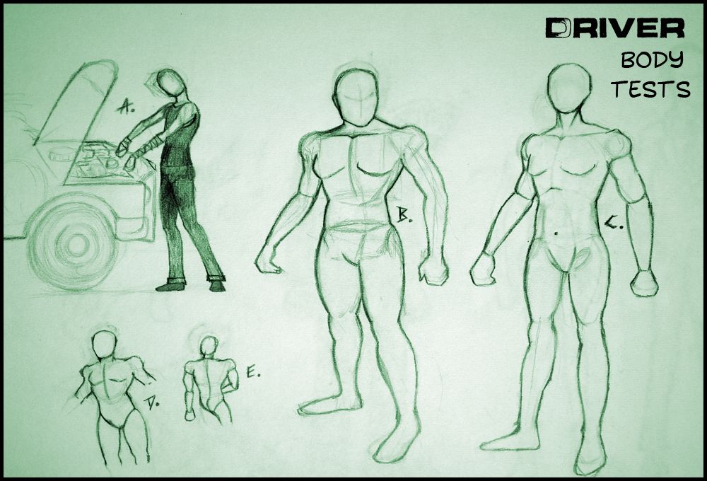
Anyway I have a couple of things to write up here, this is my first time seriously experimenting with form, after Justin's character Unit I really wanted to come to grips with how form can change the demeanour of a character. I did it in a previous post on super man but this time I wanted to do it on form not a character everyone knows. I did it mainly by blocking out the body making a kind of mannequin... This post is also about the stage 1 sketch phase I always tend to think of concept art in stages. You have stage 1 which is just sketch and freehand stuff (not finished). Then you have stage 2 - inked with basic colour and costume tests. Then you have stage 3 which is a coloured image in a pose (proper concept art). Its just easier to organise it this way in my head. Stage 3 will not be far behind this I promise you that!
Anyway lets get on with this post, I hope it's not completely noob-like.
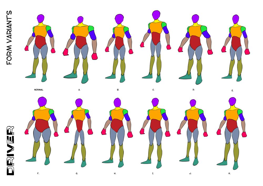
After fleshing out the basic form of an adult male I decided to go on a little journey (one I had never taken before). I wanted to put a little more of Justin's advice into practice (Shown above). I broke the male body up into segments and then began playing with the individual elements of form using the transform tools in Photoshop. It was just easier then having to draw out all of the forms and gave me much quicker results. From these I like E, I, J & K.
E I based mainly on the comic book genre, he's not overly muscly. The head is slightly bigger and the chest is slightly smaller making him less imposing... a regular guy. I tend to keep a little of the upper body mass, I extended the neck to inflate his upper this keeps him trim but big. J is based on the tough persona, notice the small head meaning he is a bit of an idiot but his upper body makes him indestructible. This is illustrated quite nicely against his small lower body. Last but not least K which I kept to be a tall normal again I extended the neck further on this one to make him more imposing, the hands are a little bigger too... You may notice that in more then one of them...
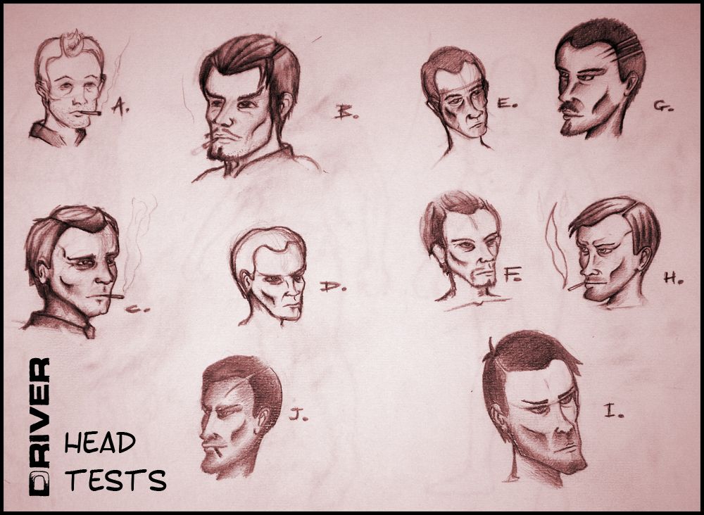
Next I began playing with heads, these were the best of the rest, personal favourites here are H, I & J. H makes him look younger to live up to the name "Kid" in some of the books instances. I tried removing the cigarette a few times but he just looked cooler with a trim cigarette in his mouth. I had the hair forward in H not to sure about that in the 1930s so I ended up brushing it back for the J image. I also toyed with the idea of giving him a scar or something to show that he's been in a few close calls over the course of his career.
The stubble really helps sell the cool image too, I just think it works. I wanted to keep him trim and keep him imposing, I found when I aged him (C & E) he looked less Kid like and more like an old petrol station attendant. I even had a play with beards (B & F) but I don't know they just didn't feel right to me... Made him look more posh and I wanted a bit of grit in his persona.
From there I went to play with the shape of his body taking it more into actual form shapes from the form variants at the top of this post. The first image I drew up had him very skinny (A), I liked this but I was not sure I added the car in just to get an idea of what it could look like him playing around inside his Pontiac. As I said from there I just wanted to play with a couple of other forms which gave me B making him really brute like but I was not sure. He looked cool stocky but I wasn't sure if it was him, I didn't want to take away from the character.
C, D & E were just further form exploration tests from different angles. I was just trying things out to try and imagine some alternate versions of the drivers shape. At this point I had more or less decided that I did not want him to be big, just smart and to know the roads like the back of his hand. And of course to be certifiably shit hot on the road.
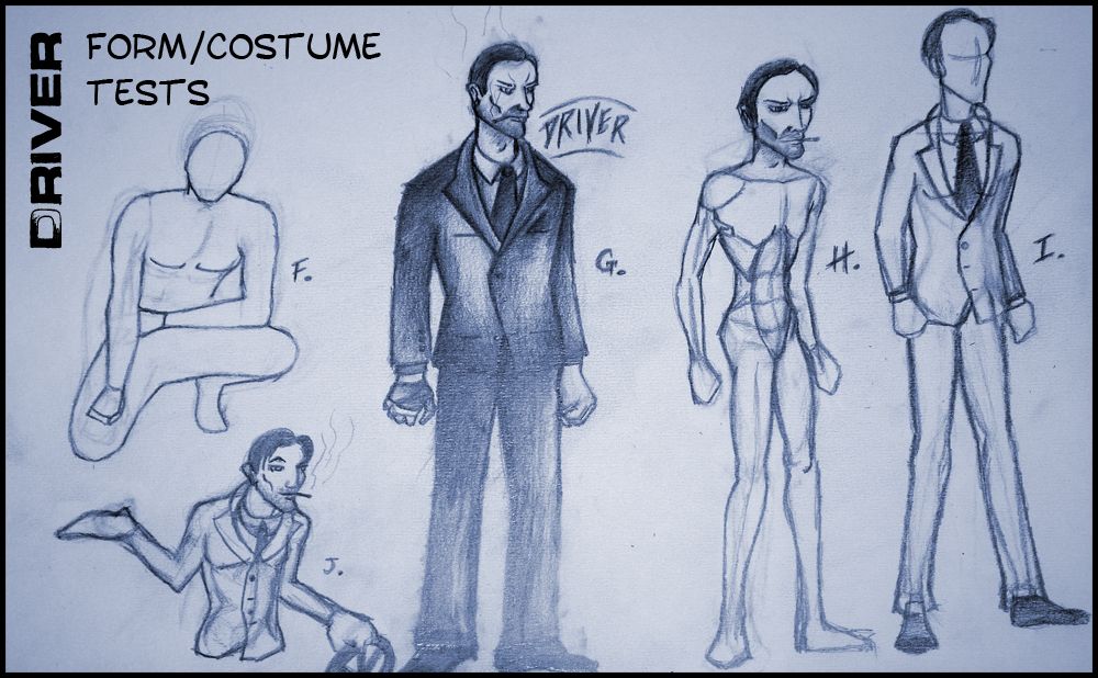
Last but not least came the form/costume tests. After playing with some basic shapes I had decided I didn't want him to be macho just cool. I had played with a pose idea (F) which just didn't work for me, "he's not in a boy-band" I thought to myself. I dropped the image flat and moved on to blocking out a standard version of "Driver" (G). I then dressed him in the suit using the reference imagery I had posted a few days back. I took the liberty of adopting the walking dead's "Giant Hands" which is why it looks like he has wrecking balls on the end of his arms.
The feet are also really flat as I also found from the "Walking Dead" so you can attribute that to them. I kept the head basic but had enough oomph to play with the hair and the cigarette. I liked the image, looked much cooler then some muscle bound idiot. Still he looked rather villainous to me which is good but it could be bad too. So then I moved onto H and made his head bigger keeping the body rather trim, just to see if it would pop, I liked it but I dunno I felt he lost a little something. I was a basic "phoenix wright" play, it certainly did make him more of a thinking man.
I helped me reach J which really fell into its own, his character seems more accessible as the character expressed in J. There is an element to him which could be friendly but there is also a shadiness to him. I kept the giant hands again for J and I really preferred it in this image, I also love the way the suit sat on his body, it looks less professional but professional enough to be a ground breaking character.
Anyway I will flesh out the Ideas expressed on these pages when I get over to Stage 2 and then eventually when I come to finalise them in Stage 3. I have other stage 1 ideas to play with yet but thank you everyone for being patient with me.
Take it easy!
Over & Out,
xXStItChXx
Been working away hard on my idea for my "Driver" character for my project "A short Drive between Two lives" (sometimes abbreviated "A Short Drive"). There has been quite a bit of soul searching and playing with different forms and head types etc. I think I have it at a place now that I know where I will be taking him for stage 2 and beyond. I'm a little gutted that it has taken as long as it has just to get past this stage. The researching faze can get a little draining I don't mind saying. I was so proud of the synopsis that I wrote for the game that I really felt I had to capture this mans personality in an expression or in the way he holds himself etc. The next phase will be working on getting some stage 1 concept for the cars and a little for the environment just so we get some background on this game. Of course the games characters will be the priority but I will fit a little bit in here and there so keep your eyes peeled.
Anyway I have a couple of things to write up here, this is my first time seriously experimenting with form, after Justin's character Unit I really wanted to come to grips with how form can change the demeanour of a character. I did it in a previous post on super man but this time I wanted to do it on form not a character everyone knows. I did it mainly by blocking out the body making a kind of mannequin... This post is also about the stage 1 sketch phase I always tend to think of concept art in stages. You have stage 1 which is just sketch and freehand stuff (not finished). Then you have stage 2 - inked with basic colour and costume tests. Then you have stage 3 which is a coloured image in a pose (proper concept art). Its just easier to organise it this way in my head. Stage 3 will not be far behind this I promise you that!
Anyway lets get on with this post, I hope it's not completely noob-like.
After fleshing out the basic form of an adult male I decided to go on a little journey (one I had never taken before). I wanted to put a little more of Justin's advice into practice (Shown above). I broke the male body up into segments and then began playing with the individual elements of form using the transform tools in Photoshop. It was just easier then having to draw out all of the forms and gave me much quicker results. From these I like E, I, J & K.
E I based mainly on the comic book genre, he's not overly muscly. The head is slightly bigger and the chest is slightly smaller making him less imposing... a regular guy. I tend to keep a little of the upper body mass, I extended the neck to inflate his upper this keeps him trim but big. J is based on the tough persona, notice the small head meaning he is a bit of an idiot but his upper body makes him indestructible. This is illustrated quite nicely against his small lower body. Last but not least K which I kept to be a tall normal again I extended the neck further on this one to make him more imposing, the hands are a little bigger too... You may notice that in more then one of them...
Next I began playing with heads, these were the best of the rest, personal favourites here are H, I & J. H makes him look younger to live up to the name "Kid" in some of the books instances. I tried removing the cigarette a few times but he just looked cooler with a trim cigarette in his mouth. I had the hair forward in H not to sure about that in the 1930s so I ended up brushing it back for the J image. I also toyed with the idea of giving him a scar or something to show that he's been in a few close calls over the course of his career.
The stubble really helps sell the cool image too, I just think it works. I wanted to keep him trim and keep him imposing, I found when I aged him (C & E) he looked less Kid like and more like an old petrol station attendant. I even had a play with beards (B & F) but I don't know they just didn't feel right to me... Made him look more posh and I wanted a bit of grit in his persona.
From there I went to play with the shape of his body taking it more into actual form shapes from the form variants at the top of this post. The first image I drew up had him very skinny (A), I liked this but I was not sure I added the car in just to get an idea of what it could look like him playing around inside his Pontiac. As I said from there I just wanted to play with a couple of other forms which gave me B making him really brute like but I was not sure. He looked cool stocky but I wasn't sure if it was him, I didn't want to take away from the character.
C, D & E were just further form exploration tests from different angles. I was just trying things out to try and imagine some alternate versions of the drivers shape. At this point I had more or less decided that I did not want him to be big, just smart and to know the roads like the back of his hand. And of course to be certifiably shit hot on the road.
Last but not least came the form/costume tests. After playing with some basic shapes I had decided I didn't want him to be macho just cool. I had played with a pose idea (F) which just didn't work for me, "he's not in a boy-band" I thought to myself. I dropped the image flat and moved on to blocking out a standard version of "Driver" (G). I then dressed him in the suit using the reference imagery I had posted a few days back. I took the liberty of adopting the walking dead's "Giant Hands" which is why it looks like he has wrecking balls on the end of his arms.
The feet are also really flat as I also found from the "Walking Dead" so you can attribute that to them. I kept the head basic but had enough oomph to play with the hair and the cigarette. I liked the image, looked much cooler then some muscle bound idiot. Still he looked rather villainous to me which is good but it could be bad too. So then I moved onto H and made his head bigger keeping the body rather trim, just to see if it would pop, I liked it but I dunno I felt he lost a little something. I was a basic "phoenix wright" play, it certainly did make him more of a thinking man.
I helped me reach J which really fell into its own, his character seems more accessible as the character expressed in J. There is an element to him which could be friendly but there is also a shadiness to him. I kept the giant hands again for J and I really preferred it in this image, I also love the way the suit sat on his body, it looks less professional but professional enough to be a ground breaking character.
Anyway I will flesh out the Ideas expressed on these pages when I get over to Stage 2 and then eventually when I come to finalise them in Stage 3. I have other stage 1 ideas to play with yet but thank you everyone for being patient with me.
Take it easy!
Over & Out,
xXStItChXx
Saturday 16 February 2013
Thursday 14 February 2013
Unit 9: Adaptation - Visual Research
Hello Everyone,
New day, new post, I have been doing a lot of soul searching for this unit but I have narrowed down my research tasks and I am pleased to say that this will hopefully be the last one. For this Unit I am adapting "Drive" from text into games characters... 3D Models - 3 to be exact, a first hand classic 1930s show car, a second hand classic 1930s hidden muscle car and the man who is to drive them all. I am plotting a synopsis for the fictional world which this driver inhabits, as well as Character Biographies, underlining the Driver and a little background on his key cars. Now that's out of the way, this post is about my visual influence more so then background of the period. Alan suggested that I look through classic style noir comics which I did my best to locate, the earliest I could find was mostly 1950s which stuff like the "Detective Book" and "A contract with god" by Will Eisner.
I decided to compare this to some of my favourite modern comic art among those Ashley Wood, Charlie Adlard & Tony Moore. I didn't like how in my pre-pitch presentation I had a rather vague explanation of what I meant by "graphic novel". At least now I can name drop and centre my ideas of comic styles that I prefer. I even went so far as to check out other types of 3D comic style art, stuff that I liked the look of and in some cases from media which I like. I wrap this up with some design choices (which I had already made in my pre-pitch) but I just wanted people to see where they came from and that I wasn't just making up decisions on the spot (I know how much my tutors hate that ha-ha).
Anyway Lets begin the post!
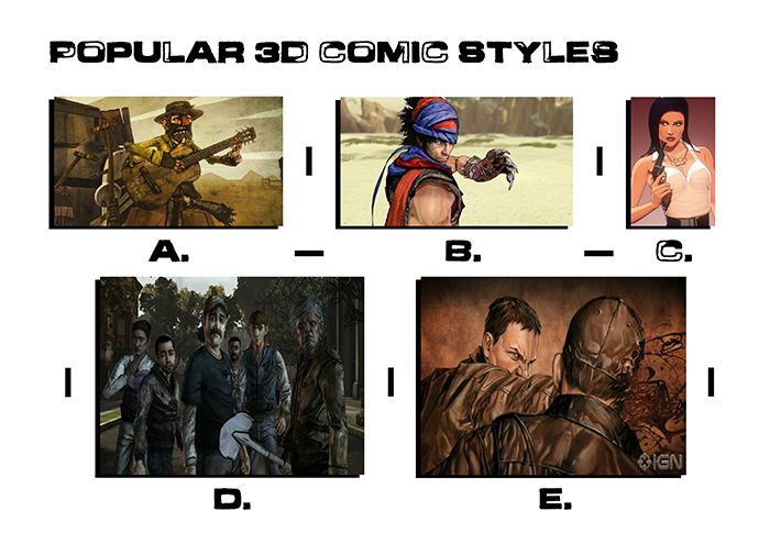
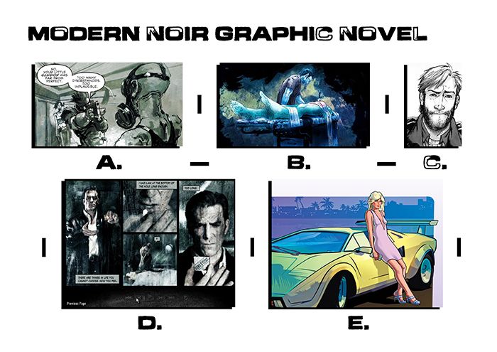 Before delving into whereabouts I wanted to place my work I decided to venture into what I liked in more contemporary noir. I found myself dredging up one of my favourites "Ashley Wood" (A) - "Metal Gear Solid" comic franchise. A form of line work with block forms, very nice and rough edged kind of gives the illusion of action in art. From there I went to looking at the regular "Dexter" podcast created by "Bill Sienkiewicz" again a kind of elaborate action based art using blocks of colour in horrific tones. Next of course (C) "The Walking Dead" Charlie Adlard and Tony Moore a real fine line approach, really gives the comic book vibe, to top it off it is completely black and white. Next, "Max Payne 2" (D) a classic from 2003 which ran a narrative along with the game in a surreal comic style. Last but not least (E) "Grand Theft Auto Vice City"... very colourful in comparison using a bright but simple colour pallet.
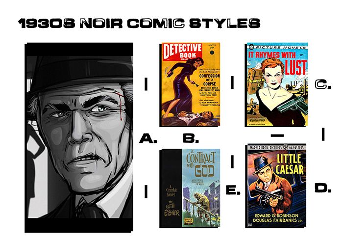 Next I decided to check out Noir as far back as I could go, the most recent being a deviant art piece by a man called "DJCoulz" I didn't want to have to name drop an Alias but there it is, anyway I liked the style of that image. I decided to contrast the image with comic styles past Alan showed the "little Caesar" image (D) to me and mentioned it as an old comic style feel. I found similarities in Fiction Houses "Detective Book", the paper isn't perfect so the images are slightly washed down. Things were not pristine in Noir for the 1930s mainly because of the types of paper and tools needed to create them at the time. Alan described it to me as a kind of watered down comic look. I think his vision for the 1930s style is to not have a pristine art vibe like the (A) but more like the detective book (D). It was nice to have that comparison just so I could justify what he was talking about in my creative minds eye.
 Next I decided to look into comic styles that have been used in 3D, something that is not pristine Alan had earlier suggested Bo Mathorn's "The Backwater Gospel" (A). A kind of run down low poly texture based exploit. From there I went to my classic gaming experiences namely "The Prince of Persia 2008" which adopted a kind of cell shaded approach with drawn on textures very much like "The Backwater Gospel" (A). From there I started contemplating the "Grand Theft Auto theme" expressed in the modern graphic novel style. That's when I stumbled onto artist Jasper Hesslings blog and discovered his "Comic Book Girl" (C) which looked cell shaded without the hard surface lines. Every edge is understated with the keys being in colour and tone. From there I regressed and went back to "The Walking Dead" games hard black edged style suggested in both (A) and (B). "E" is the Animated Iron Man comic "Extremis" which has a gritty sense but still suggests richer colour values (like C).
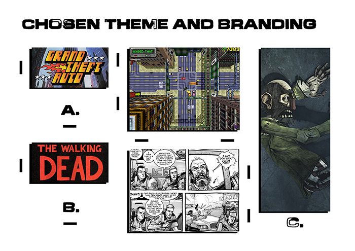 Last but not least I ironed out my final choices really, it would be nice to have a merging of "The Walking Dead" (B) and the "Backwater Gospel" (C) but in a 1930s setting. I would probably be more inclined to lose the colour entirely to keep it from falling into the closer territory of "The Walking Dead Game". The top down view (shown in A) - "Grand Theft Auto" is something that will be expressed entirely in my branding. I visualise my images on a page as top down buildings with lines being the lines in the road. If the game existed it could play like that and then return close to 3D cinematic's. Why does a building have to be comprised of windows, concrete & debris. Why can't a building be some ones interpretation of a building. Whose to say its not a cluster of images on a white page? I think a noir game world will be a nice place to set this particular tale, having had another good discussion with Alan today my next move is to find the scenario for this game.
So in conclusion I know that I want a comic book style which I am angling toward a noir style world in which a "Driver" spends his days crashing cars for carnival entertainment and at night drives criminals to jobs. The double life angle works and creatively I wish to make the style of the character and cars based on "The Walking Dead" comic in a 1930s setting. The backwater gospel is the style in which I will be implementing the 3D elements of the characters. The construction of the characters will be closely knitted in the style of Charlie Adlard & Tony Moore.
Anyway that's me done for this post, I will be getting on with a small Synopsis and structure next just to give some situation to my games world so people can empathise with it more.
Take it easy!
xXStItChXx
New day, new post, I have been doing a lot of soul searching for this unit but I have narrowed down my research tasks and I am pleased to say that this will hopefully be the last one. For this Unit I am adapting "Drive" from text into games characters... 3D Models - 3 to be exact, a first hand classic 1930s show car, a second hand classic 1930s hidden muscle car and the man who is to drive them all. I am plotting a synopsis for the fictional world which this driver inhabits, as well as Character Biographies, underlining the Driver and a little background on his key cars. Now that's out of the way, this post is about my visual influence more so then background of the period. Alan suggested that I look through classic style noir comics which I did my best to locate, the earliest I could find was mostly 1950s which stuff like the "Detective Book" and "A contract with god" by Will Eisner.
I decided to compare this to some of my favourite modern comic art among those Ashley Wood, Charlie Adlard & Tony Moore. I didn't like how in my pre-pitch presentation I had a rather vague explanation of what I meant by "graphic novel". At least now I can name drop and centre my ideas of comic styles that I prefer. I even went so far as to check out other types of 3D comic style art, stuff that I liked the look of and in some cases from media which I like. I wrap this up with some design choices (which I had already made in my pre-pitch) but I just wanted people to see where they came from and that I wasn't just making up decisions on the spot (I know how much my tutors hate that ha-ha).
Anyway Lets begin the post!
So in conclusion I know that I want a comic book style which I am angling toward a noir style world in which a "Driver" spends his days crashing cars for carnival entertainment and at night drives criminals to jobs. The double life angle works and creatively I wish to make the style of the character and cars based on "The Walking Dead" comic in a 1930s setting. The backwater gospel is the style in which I will be implementing the 3D elements of the characters. The construction of the characters will be closely knitted in the style of Charlie Adlard & Tony Moore.
Anyway that's me done for this post, I will be getting on with a small Synopsis and structure next just to give some situation to my games world so people can empathise with it more.
Take it easy!
xXStItChXx
Wednesday 13 February 2013
Unit 9: Adaptation - 1930s Research
Hello Everyone,
The other week I went in and grabbed a tonne of Library Books for this post so I will save time by mentioning that a lot of the imagery in here is not from Google I have grabbed imagery from: "Cars that Time Forgot", "Autopia, Cars & Culture" & "Fashions of a Decade - The 1930s". I have done a little reading on the period of the 1930s as well as some research into popular car models of the era. What I found difficult to decide was the look (I.e. I wanted the cars to look cool and not too cheesy). I have got quite a few things to lay out in this post, which I will consider the backbone of things that are to come in this unit. I have a section on Men's Fashion, Dare Devils of the period my preferred top 5 "Day" cars and top 5 "Night" cars, as well as a bit of info on the setting (I.e. the great depression: USA).
You can think of some of these images as influence maps because through searching I have picked the majority which I will play with and refine. This is just more of a boiled down researching spree. I am not saying that all of these are 100% concrete, I may have a spark of inspiration from something else and choose to devise that. Don't hold me to all the choices made here, I am just feeling my way but I think this post is a great start to my big journey. I am much more prepared then I was a few weeks back so for that I am at least happy. I haven't forgot about Maya tutorials and everything like that I am just trying to get this Unit underway so I can begin thinking and working on other bits and pieces.
Well I wont waffle further lets get on with the post:
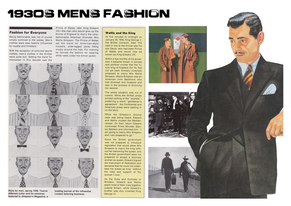
These are all articles from the within the Fashion Book I attributed at the top of this post, I was a little disappointed that there wasn't more clothe choices for men but I did manage to grab a few nice things that me and Alan talked about (specifically the classic Rain-mack - noir private detectives, etc). Men's suits were popular among the higher class, but thinking about it I may want to go lower class (take a look at the men walking away from the camera in the image above). It also got me thinking about my drivers demeanour, do I want him to appear poor or rich... This was more of a juggling act, I am inclined to keep him wealthy, which makes clients take him more seriously (good and bad). A poor man getaway driver would probably appear less professional (less bond-like).
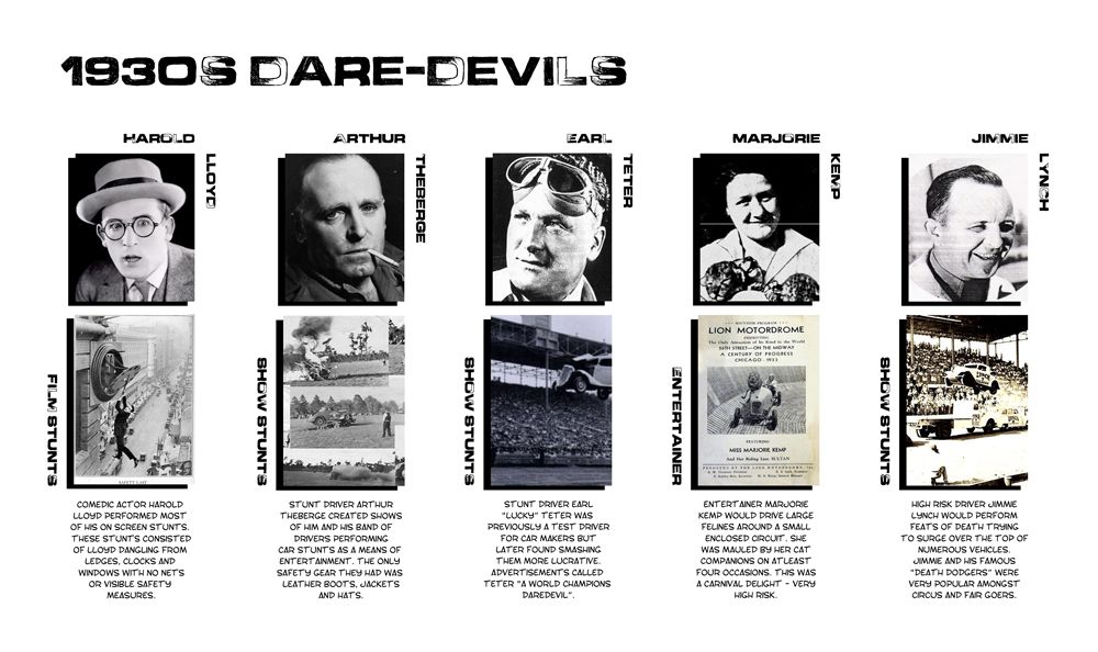 Next I was thinking about Dare-Devils of the 1930s Alan suggested Harold Lloyd to me to demonstrate actors as dare-devils in film around the 1930s. Lloyd from what I read did all of his own stunts and even blew off his fingers with what he thought was a prop explosive. After him I found myself finding carnival and fairground entertainers (known at the time for being dare-devils). Among others Arthur Theberge, Earl "Lucky" Teter & Jimmie Lynch who did death defying stunts at shows each about as crazy as the last. From what I could find these appear to be some of the first of the stunt profession (at least involving vehicles). There was also the likes of Marjorie Kemp who drove a Car with a Tiger what I considered to be more of a form of entertainment then a death defying jump still its defiantly insane.
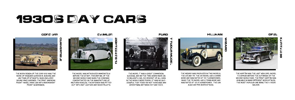 Next I decided to breakdown my idea of the "Day" car, having no knowledge of cars I found myself investing my attention into cool looking 1930s cars as opposed to power vehicles. My favourite of these was the "Cord Convertible", I love convertible cars even though we live in a climate which we would hardly ever use them. If I was forced to consider another I would say that I love the "Opel Kapitan", really cool looking and I love the black paint job. The "Hillman Wizard" was what I considered to be closer to the text, mainly more about looks then speed, still the "Ford T Tudor" could also be considered a posh car. Never the less from the images above I still prefer the "Cord" or the "Opel" for my secondary asset.
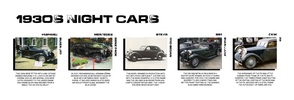 Next I started looking into my chosen "night" second hand car lot power machine. From my understanding of the "Drive" source material it was meant to be an understated car that could otherwise pack a punch if needed. Now I won't lie most of the horse power from the cars above isn't great but to be honest not many was from the 1930s period. I had little luck finding older source images with the exception of the "DKW F5" which looked really understated and old. I loved the idea of the "Mercedes" mainly because it is an armoured car model something that would be ideal for a criminal evading police chases and shootouts. The "Steyr 220" I loved the look of it just looks classic and I really did like the thought of seeing it all old and beaten up in a car lot.
 Last but not least I wanted to elaborate a little on the setting for my characters, I will say right now this is not visual style just a basic grab of the world in the state of the 1930s (I.e. the great depression). I also went to elaborate a little on how this would effect my "Driver" character which may or may not be motivations for him seeking the criminal life. I found it a good motivator that a man seek a second (illegal) job in hopes of acquiring more money. Of course this does come with the dilemma of me wanting a well groomed "Driver" unless this is the side he hides from people so he is taken seriously - a professional. I really think the setting for this idea will be interesting and will certainly motivate a more elaborate narrative then I previously thought. It will also be interesting to see the 1930s from a stunt drivers point of view (something I will be fleshing out soon).
I will be researching more into fashions particularly and hopefully will begin to explore these ideas in sketches over the next couple of days. I needed to take a step back just to think about how all of this was going to work. I don't like thinking up a baseless object and then plan a load of creativity around that (that's not the goal of the brief anyway). The goal here is so everything has a place and more importantly that it works on all levels visually and in regard to a narrative.
Well, that's me done here for this post, I will be back soon with some visual and style research so people can see where I want to take this. I hated how broad I was by just saying "graphic novel" in the pre-pitch... I want to base this on an artist so people can see the theme I am aiming for here.
Take it easy people!
xXStItChXx
The other week I went in and grabbed a tonne of Library Books for this post so I will save time by mentioning that a lot of the imagery in here is not from Google I have grabbed imagery from: "Cars that Time Forgot", "Autopia, Cars & Culture" & "Fashions of a Decade - The 1930s". I have done a little reading on the period of the 1930s as well as some research into popular car models of the era. What I found difficult to decide was the look (I.e. I wanted the cars to look cool and not too cheesy). I have got quite a few things to lay out in this post, which I will consider the backbone of things that are to come in this unit. I have a section on Men's Fashion, Dare Devils of the period my preferred top 5 "Day" cars and top 5 "Night" cars, as well as a bit of info on the setting (I.e. the great depression: USA).
You can think of some of these images as influence maps because through searching I have picked the majority which I will play with and refine. This is just more of a boiled down researching spree. I am not saying that all of these are 100% concrete, I may have a spark of inspiration from something else and choose to devise that. Don't hold me to all the choices made here, I am just feeling my way but I think this post is a great start to my big journey. I am much more prepared then I was a few weeks back so for that I am at least happy. I haven't forgot about Maya tutorials and everything like that I am just trying to get this Unit underway so I can begin thinking and working on other bits and pieces.
Well I wont waffle further lets get on with the post:
These are all articles from the within the Fashion Book I attributed at the top of this post, I was a little disappointed that there wasn't more clothe choices for men but I did manage to grab a few nice things that me and Alan talked about (specifically the classic Rain-mack - noir private detectives, etc). Men's suits were popular among the higher class, but thinking about it I may want to go lower class (take a look at the men walking away from the camera in the image above). It also got me thinking about my drivers demeanour, do I want him to appear poor or rich... This was more of a juggling act, I am inclined to keep him wealthy, which makes clients take him more seriously (good and bad). A poor man getaway driver would probably appear less professional (less bond-like).
I will be researching more into fashions particularly and hopefully will begin to explore these ideas in sketches over the next couple of days. I needed to take a step back just to think about how all of this was going to work. I don't like thinking up a baseless object and then plan a load of creativity around that (that's not the goal of the brief anyway). The goal here is so everything has a place and more importantly that it works on all levels visually and in regard to a narrative.
Well, that's me done here for this post, I will be back soon with some visual and style research so people can see where I want to take this. I hated how broad I was by just saying "graphic novel" in the pre-pitch... I want to base this on an artist so people can see the theme I am aiming for here.
Take it easy people!
xXStItChXx
Tuesday 12 February 2013
Unit 9: Adaptation - Introduction
Hello Everyone,
I meant to do this post yesterday but I dunno things have just been "interesting" at home and well I've been occupied but I haven't forgotten what is expected for this brief. It's been on my mind constantly while I have been dealing with other stuff. Suffice to say I will broadly go over where my thoughts have taken me for this unit. People are already aware that I have chosen the book "Drive" by James Sallis to work my adaptation on. Of course I have had some internal battles with what adaptation means for this brief but through discussion with Alan I have a fairly good idea what is expected of me, and where the limits are.
For those of you that do not know the aspect I am adapting is Drive's underpinning - "a driver who drives during the day as a stuntman and at night as a getaway driver". For this I chose to adapt the driver into 3 games models ("the day car" - stuntman, "the night car", getaway driver and of course the driver himself). Through suggestions within the pitch Alan advised me to consider sending the period further back then previously suggested in my pre-pitch document (from 1970s to the 1930s).
One of the things I found myself doing earlier on was trying to pull ideas from the "double life" theme but through discussion with Alan found they were less preferable and I assume less like an adaptation of a theme (I.e. I cannot change too much or undo the dangerous day vs night jobs - as they are the theme I have chosen).
 As I mentioned above the elements I will be adapting from are from the novel "Drive" set in the 1980s into 1930s game assets. Game assets limit the poly-count but other then that they are no more or less complicated, this will mean less complicated meshes and more complicated textures and normals. The first asset I have entitled the "day" car which from the text is a "58 Chevy" I will be finding an alternate car (its equivalent in the 1930s) and create it in low poly geometry.
The second asset is the "Driver" a man who lives the double life of "day" fame and "night" crime. In his case I just need a quiet professional who wears 1930s attire, the real fun will be with his facial features and true identity. The third and final games model will be the night car (which in the 1980s book is described as a "10 year old dodge"). This will be more of a beaten second hand car lot rust bucket - of course in a 1930s alternate.
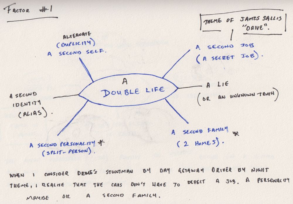
Factor #1 (shown above) was my initial breakdown of "the double life" I ended up not using this after my discussion with Alan as I was trying to find more intriguing ways to show the driver as a kind of split personality instead of a job. I mentioned a few of these things to Alan but none of them drove further then the idea of "the second job", as defined by the text. I just gathered that I couldn't change the theme too much from the original text (making the second job be the sole choice). Still all the same I thought it was worth showing that I had worked on alternate ideas, just trying to expand the theme past the text. In short Factor 1 was originally the base to compare with Factor 2.
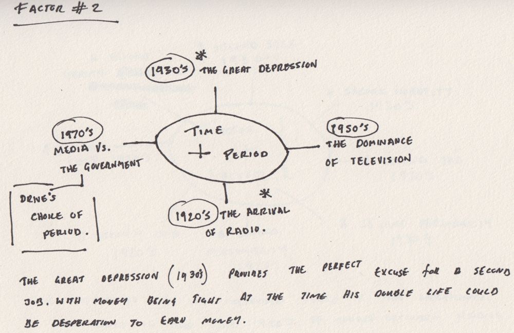
Factor #2 (shown above) was what I compared to factor 1 and that was year, during my research I found that the 1930s was the great depression. This was ideal for the setting, I couldn't think of a better reason for a person to have 2 jobs (not that It would be easy to find 2 jobs in the great depression - still it shows he must be good at what he does). The day job may not be earning the driver as much as he needs so he does the night job to acquire more money. The 1920s was another period I was considering as it was the birth of the radio but what I didn't realise was the car radio wasn't around until 1929. I really wanted a radio theme to run through this unit.
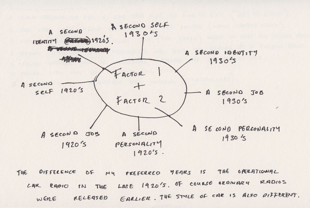
The image above shows the combination of the two, I did this mainly for my own piece of mind just so I didn't have to keep flipping around. Again the double identity themes was dropped after my discussion with Alan, I probably should have posted this up sooner on my blog just so he could have given me the Intel sooner... oh well its my bad. Still I liked some of the ideas these double life themes suggested, if it wasn't an adaptation Unit I probably would be taking this in a completely different direction. Still it was through favourable choice that Alan suggested a 1930s stuntman who doubles as a bank robber, if anything to keep it close to the original text... making the adaptation more prominent.
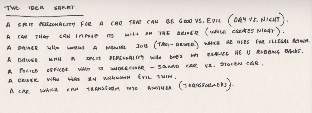
The idea sheet was some active thought when considering everything together and trying to add a short narrative. What I like to consider a "speed pitch" when someone asks you to describe something quick and fast... like a synopsis but shorter. Again this was before I had the discussion with Alan so a lot of this is themed as the "double life". I am posting this just to show that I did think about this, throughout my creative Journey on this Unit. I am glad it has been corrected but despite Alan's scepticism I did keep one or two from this sheet and move them forward to my final thoughts. I ended up settling on what I knew worked but I did like the taxi driver angle, I think cabs can be dangerous, whose to say who's getting into your cab... and he could double as a getaway driver (what blends into the background better then a 1930s cab). Oh well.

So to conclude I ended up sticking with the second job from my factor #1 graph based on "double life" mainly because it keeps it closer to the original text of "Drive". Alan suggested the 1930s during the pre-pitch and I concur (factor #2) mainly because the settings of the 1970s and 80s are not far apart - in order to truly "adapt" I have to go to a time completely out of character to the original text of "Drive". I found the concise element to be the "night" - getaway driver when considering dangerous jobs, these can be located back in the 1930s, the "day" had me considering 4 different ideas (shown above) but Alan still suggested I stick with a 1930s stuntman. I think this is mainly to once again keep it close to the original text. Still all the same I thought I would offer alternates.
My next task for this unit is to investigate 1930s cars and pick the opposing "day" and "night" 1970s alternates suggested by the text. The driver will be wearing 1930s apparel and will be a fierce but respected customer. I like the idea of a classic 1930s hat as shown in the private detective picture but I'm not 100% there. Alan suggested that I look at 1930s comics as it is when Noir was born so I will be doing that when I consider my visual research post (on its way very soon). I have opted to keep the theme of these 3D models very comic book and whatever I can do to attain the old school look I will work at.
Well, that's this post, I will be back with more shortly.
Take it easy!
xXStItChXx
I meant to do this post yesterday but I dunno things have just been "interesting" at home and well I've been occupied but I haven't forgotten what is expected for this brief. It's been on my mind constantly while I have been dealing with other stuff. Suffice to say I will broadly go over where my thoughts have taken me for this unit. People are already aware that I have chosen the book "Drive" by James Sallis to work my adaptation on. Of course I have had some internal battles with what adaptation means for this brief but through discussion with Alan I have a fairly good idea what is expected of me, and where the limits are.
For those of you that do not know the aspect I am adapting is Drive's underpinning - "a driver who drives during the day as a stuntman and at night as a getaway driver". For this I chose to adapt the driver into 3 games models ("the day car" - stuntman, "the night car", getaway driver and of course the driver himself). Through suggestions within the pitch Alan advised me to consider sending the period further back then previously suggested in my pre-pitch document (from 1970s to the 1930s).
One of the things I found myself doing earlier on was trying to pull ideas from the "double life" theme but through discussion with Alan found they were less preferable and I assume less like an adaptation of a theme (I.e. I cannot change too much or undo the dangerous day vs night jobs - as they are the theme I have chosen).
The second asset is the "Driver" a man who lives the double life of "day" fame and "night" crime. In his case I just need a quiet professional who wears 1930s attire, the real fun will be with his facial features and true identity. The third and final games model will be the night car (which in the 1980s book is described as a "10 year old dodge"). This will be more of a beaten second hand car lot rust bucket - of course in a 1930s alternate.
Factor #1 (shown above) was my initial breakdown of "the double life" I ended up not using this after my discussion with Alan as I was trying to find more intriguing ways to show the driver as a kind of split personality instead of a job. I mentioned a few of these things to Alan but none of them drove further then the idea of "the second job", as defined by the text. I just gathered that I couldn't change the theme too much from the original text (making the second job be the sole choice). Still all the same I thought it was worth showing that I had worked on alternate ideas, just trying to expand the theme past the text. In short Factor 1 was originally the base to compare with Factor 2.
Factor #2 (shown above) was what I compared to factor 1 and that was year, during my research I found that the 1930s was the great depression. This was ideal for the setting, I couldn't think of a better reason for a person to have 2 jobs (not that It would be easy to find 2 jobs in the great depression - still it shows he must be good at what he does). The day job may not be earning the driver as much as he needs so he does the night job to acquire more money. The 1920s was another period I was considering as it was the birth of the radio but what I didn't realise was the car radio wasn't around until 1929. I really wanted a radio theme to run through this unit.
The image above shows the combination of the two, I did this mainly for my own piece of mind just so I didn't have to keep flipping around. Again the double identity themes was dropped after my discussion with Alan, I probably should have posted this up sooner on my blog just so he could have given me the Intel sooner... oh well its my bad. Still I liked some of the ideas these double life themes suggested, if it wasn't an adaptation Unit I probably would be taking this in a completely different direction. Still it was through favourable choice that Alan suggested a 1930s stuntman who doubles as a bank robber, if anything to keep it close to the original text... making the adaptation more prominent.
The idea sheet was some active thought when considering everything together and trying to add a short narrative. What I like to consider a "speed pitch" when someone asks you to describe something quick and fast... like a synopsis but shorter. Again this was before I had the discussion with Alan so a lot of this is themed as the "double life". I am posting this just to show that I did think about this, throughout my creative Journey on this Unit. I am glad it has been corrected but despite Alan's scepticism I did keep one or two from this sheet and move them forward to my final thoughts. I ended up settling on what I knew worked but I did like the taxi driver angle, I think cabs can be dangerous, whose to say who's getting into your cab... and he could double as a getaway driver (what blends into the background better then a 1930s cab). Oh well.
So to conclude I ended up sticking with the second job from my factor #1 graph based on "double life" mainly because it keeps it closer to the original text of "Drive". Alan suggested the 1930s during the pre-pitch and I concur (factor #2) mainly because the settings of the 1970s and 80s are not far apart - in order to truly "adapt" I have to go to a time completely out of character to the original text of "Drive". I found the concise element to be the "night" - getaway driver when considering dangerous jobs, these can be located back in the 1930s, the "day" had me considering 4 different ideas (shown above) but Alan still suggested I stick with a 1930s stuntman. I think this is mainly to once again keep it close to the original text. Still all the same I thought I would offer alternates.
My next task for this unit is to investigate 1930s cars and pick the opposing "day" and "night" 1970s alternates suggested by the text. The driver will be wearing 1930s apparel and will be a fierce but respected customer. I like the idea of a classic 1930s hat as shown in the private detective picture but I'm not 100% there. Alan suggested that I look at 1930s comics as it is when Noir was born so I will be doing that when I consider my visual research post (on its way very soon). I have opted to keep the theme of these 3D models very comic book and whatever I can do to attain the old school look I will work at.
Well, that's this post, I will be back with more shortly.
Take it easy!
xXStItChXx
Wednesday 6 February 2013
Unit 9: Adaptation - Time Management (Part 1)
Hello Everyone,
Sorry I have been MIA, quite a bit of stuff has been going down but never the less I have not let the thought of this Unit escape me. Last week I presented what I planned to do in form of what I call a Pre-Pitch Document to Alan and the group. I got feedback and it's feedback I will be considering (especially after renting out tonnes of 1930s imagery from the library). Needless to say I have a couple of ideas in which to take this unit but one thing I do want to keep is the cheeky comic book feel from the grand theft auto games. I will talk about this more when I do my visual reference post either today or tomorrow... Anyway after the last Unit I needed to get some thing sorted on my end (what also didn't help was the lack of sleep).
For this Unit I have slightly less time due to the overspill from the Character Unit but at least I have a direction to go in and I think I have a good idea where I will take this brief. I have a pre-pitch document which I will put up here in good time and a number of other notes from research which I have conducted. Those of you that do not know I will be basing this unit (in one way or another) on the theme from the book "Drive" by James Sallis. The theme of the book which I wish to replicate is that of a double life. I have already been thinking of a number of ways to apply this but it was suggested in talks with Alan that I should consider going back further in time to the 1930s... I have been thinking a lot on this...
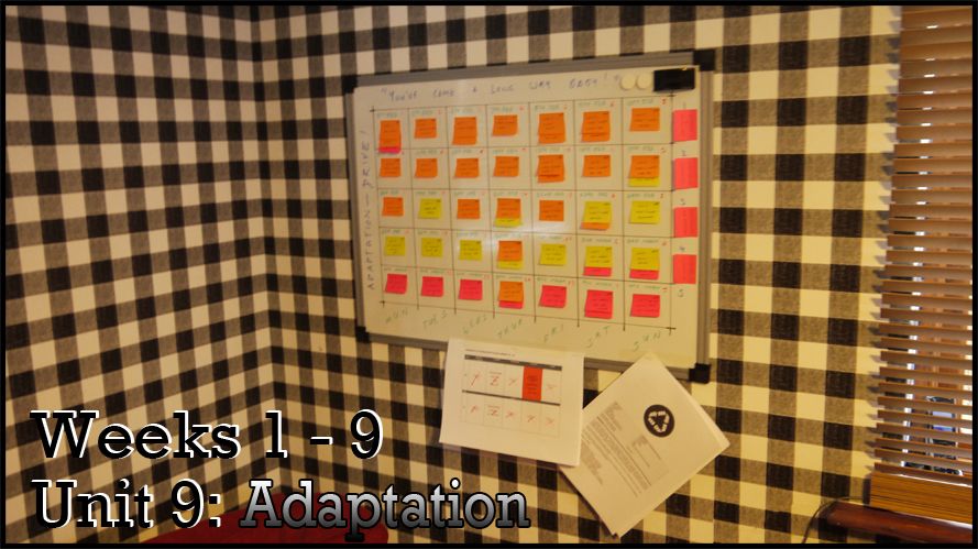
The task board for this unit is less cluttered, mainly because I think I have a decent way of spreading the results I want from this unit. Character felt a little too rushed for me so this time I will be more careful with my time constraint. I have mainly been getting into the theme of the 30s I didn't want to force anything and I wanted to consider a decent style for my character designs. I have 1 character and 2 vehicles in mind as low poly game assets. It is a little ambitious but I think if I work accordingly I will achieve the results intended. Hell I managed to create a character of Peter Creek and that only took a week, the render passes just made it awesome...
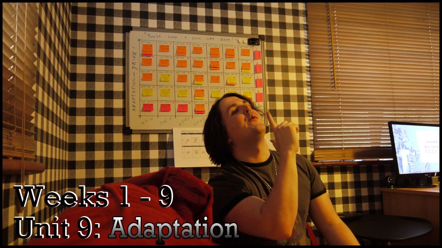
I have altered my time management process so many ways but I have learnt how to improve it more from each unit especially when considering overspill and problems going forward. I have not factored in the critical perspectives items but I figured I could spend an hour or so per day looking into what is required instead of forcing it all into a couple of days (that never has worked for any essay I have done - before or since). The key here is to be smart and not to assign myself too much on any given day, It has to be spread out and allowed further thought before commitment. Despite the drastic change from my 1970s theme I will be keeping the name of the project (A short drive between two lives) mainly because I love it. It really communicates what I feel this assignment will be about for me, two lives of a driver.
Well I think that will conclude this post, I will quickly post up the pre-pitch that I did for the presentation last week. I will do it just to show the process, the 1970s theme has been removed entirely or at least it will be. The unit as it was is just too close to the time period of "Drive", so taking it even further back is the obvious decision. I may even play with the double life theme to see if I can come up with something even more inventive then just a driver with a day job and a night job. Who knows, either way this will be pretty fun to find out.
Take it easy!
xXStItChXx
Sorry I have been MIA, quite a bit of stuff has been going down but never the less I have not let the thought of this Unit escape me. Last week I presented what I planned to do in form of what I call a Pre-Pitch Document to Alan and the group. I got feedback and it's feedback I will be considering (especially after renting out tonnes of 1930s imagery from the library). Needless to say I have a couple of ideas in which to take this unit but one thing I do want to keep is the cheeky comic book feel from the grand theft auto games. I will talk about this more when I do my visual reference post either today or tomorrow... Anyway after the last Unit I needed to get some thing sorted on my end (what also didn't help was the lack of sleep).
For this Unit I have slightly less time due to the overspill from the Character Unit but at least I have a direction to go in and I think I have a good idea where I will take this brief. I have a pre-pitch document which I will put up here in good time and a number of other notes from research which I have conducted. Those of you that do not know I will be basing this unit (in one way or another) on the theme from the book "Drive" by James Sallis. The theme of the book which I wish to replicate is that of a double life. I have already been thinking of a number of ways to apply this but it was suggested in talks with Alan that I should consider going back further in time to the 1930s... I have been thinking a lot on this...
The task board for this unit is less cluttered, mainly because I think I have a decent way of spreading the results I want from this unit. Character felt a little too rushed for me so this time I will be more careful with my time constraint. I have mainly been getting into the theme of the 30s I didn't want to force anything and I wanted to consider a decent style for my character designs. I have 1 character and 2 vehicles in mind as low poly game assets. It is a little ambitious but I think if I work accordingly I will achieve the results intended. Hell I managed to create a character of Peter Creek and that only took a week, the render passes just made it awesome...
I have altered my time management process so many ways but I have learnt how to improve it more from each unit especially when considering overspill and problems going forward. I have not factored in the critical perspectives items but I figured I could spend an hour or so per day looking into what is required instead of forcing it all into a couple of days (that never has worked for any essay I have done - before or since). The key here is to be smart and not to assign myself too much on any given day, It has to be spread out and allowed further thought before commitment. Despite the drastic change from my 1970s theme I will be keeping the name of the project (A short drive between two lives) mainly because I love it. It really communicates what I feel this assignment will be about for me, two lives of a driver.
Well I think that will conclude this post, I will quickly post up the pre-pitch that I did for the presentation last week. I will do it just to show the process, the 1970s theme has been removed entirely or at least it will be. The unit as it was is just too close to the time period of "Drive", so taking it even further back is the obvious decision. I may even play with the double life theme to see if I can come up with something even more inventive then just a driver with a day job and a night job. Who knows, either way this will be pretty fun to find out.
Take it easy!
xXStItChXx
Subscribe to:
Posts (Atom)